

07.02.21 - Meet Chris Lee, designer of the graphics for the Daniels Faculty's 2020-2021 talks series

Chris Lee
The graphics that accompany the listings for the Daniels Faculty's 2020-2021 lineup of "talks" — meaning, online events where several expert participants have a conversation on a pre-selected topic — are a little confounding to the eye. The text is chunky and pixellated, and the backgrounds are made up of asymmetrical assortments of shapes, scattered seemingly randomly across a black field.
All of that visual dissonance is, of course, entirely by design. And the one who did the designing is Chris Lee, a freelance graphic artist and educator.
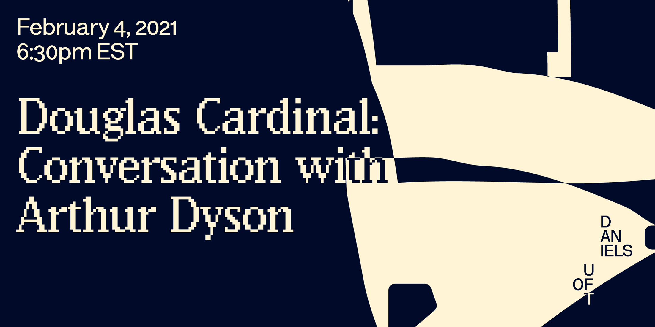
Top: Lee's design for the winter talks series. Bottom: Lee's design for this week's talk with Douglas Cardinal and Arthur Dyson.
The Daniels Faculty's design brief called for graphics that could be presented in static images and also in animations. Other than that, all Lee had to go on was the title of the talks series, "Resolutions and Agencies."
He began to think about the meaning of the word "agency" in the context of graphic design. "The scale of the graphic designer's agency is circumscribed by formal technical concerns," he says. "What colour? What typeface? What's the type program? What's the spatial conceit?"
Lee began by creating what he calls a "map" — a large digital canvas of abstract, monochrome geometric forms on a black background. By zooming in and out on different parts of his geometric map and making rectangular cut-outs of particular sections, Lee was able to create unique backgrounds for each different event graphic. "It's playing with the fundamentals of 2D form: the line, the dot, and the plane," he says.
Two designs by Chris Lee for the Daniels Faculty's fall talks series.
Lee's font choices are intended to subtly reference the "resolutions" component of the series theme. The event titles are rendered in "Lo-Res," a typeface by the digital type foundry Emigre. The series title, meanwhile, is set in Wremena, an angular serif typeface. "Lo-Res is very crass and low-resolution," Lee says. "In my mind there's a kind of counterposition between the low resolution of Lo-Res and the sharp geometry of Wremena, which resonated with thinking about scale."
Lee isn't only a graphic designer; he's also an educator. His current appointment is at Pratt Institute's Communications Design department, where he's an assistant professor.
Although he now splits his time between Toronto, Brooklyn, and Buffalo, he's originally from Toronto. After graduating from OCAD University in 2006, he landed a job as a designer at The Walrus, a Canadian magazine known for its long-form journalism. At around the same time, Lee started doing regular freelance work for C Magazine, an art periodical.
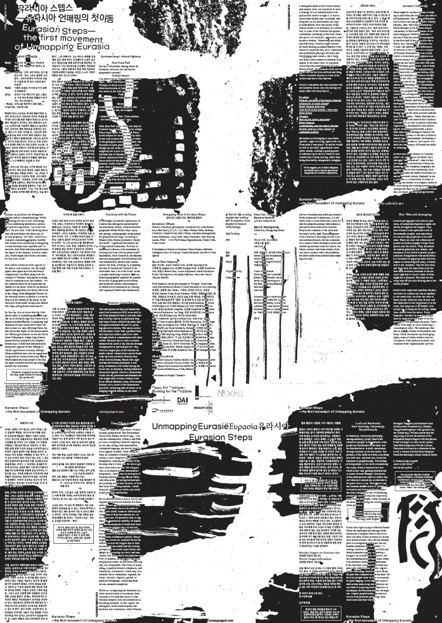
Lee's poster design for “Unmapping Eurasia,” an exhibition curated by Binna Choi and You Mi.
His introduction to the world of architecture came in 2010, when he joined the editorial board of Scapegoat, a journal of architecture, landscape architecture, and political economy. "Working for these clients got me thinking about the world of ideas in graphic design," Lee says. "I started wondering, what are people thinking about? What are the issues?"
He enrolled at the Sandberg Institute, a graduate school in the Netherlands. His master's thesis was a treatise on alternative currencies as a genre of graphic design. Today, he continues to study the design of official documents, like currencies and passports. "In spite of their banality, these genres of form are probably the most consequential types of design artifacts that we engage with," he says.
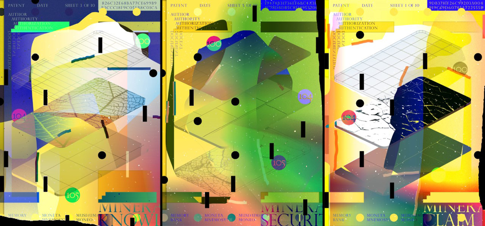
Memory Bank, a work created by Lee for an exhibition at El Museo, a gallery in Buffalo.
Lee graduated in 2010 and then spent two more years in the Netherlands, teaching and freelancing. Upon his return to Canada, he started teaching as a sessional instructor at OCAD U, worked for a while as a designer for Bruce Mau, and then landed his first full-time academic appointment at SUNY Buffalo. He was an assistant professor there until 2019, when he made the move to Pratt.
He hopes to use his designs for the Daniels Faculty's talks series as part of his teaching at Pratt. "The play with elemental two-dimensional forms is of interest to me from a pedagogical perspective," he says. "I think of it as a way for me to generate examples that I can show my students of how one can construct a visual syntax by the way one arranges elements. A circle isn't big until you put something smaller next to it."