

25.08.20 - These students spent the summer thinking about — and drawing — the COVID-19 pandemic
The COVID-19 pandemic is, in a certain sense, a design problem. The virus thrives indoors, in the built environment — meaning architects have an important role to play in prevention.
Associate professor Jeannie Kim and assistant professor Mauricio Quirós Pacheco put a handful of Daniels architecture students on the work-study payroll this summer and had them apply their design skills to the problem of studying and mitigating the spread of the virus. Here's a look at what those students produced.
Declan Roberts
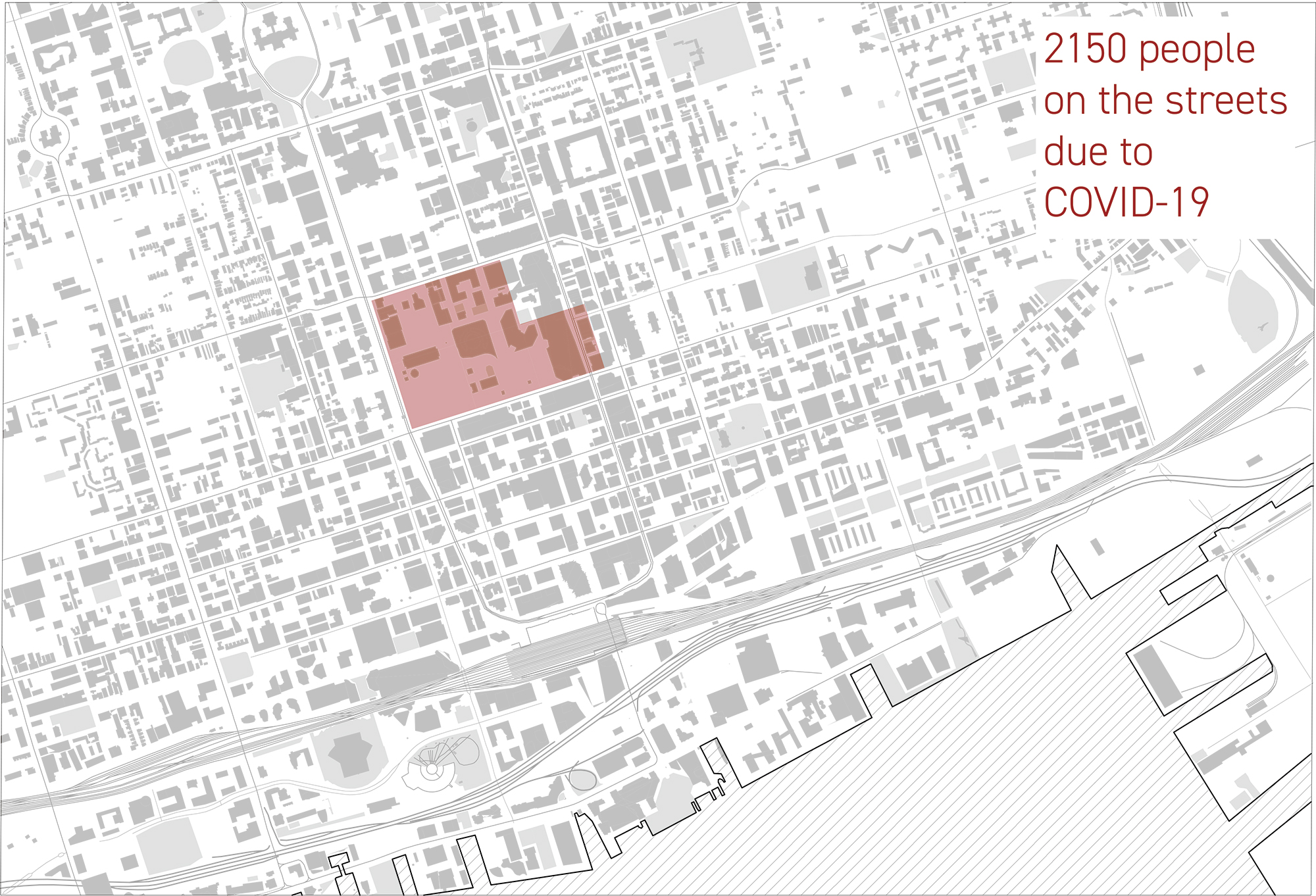
Declan, in collaboration with Master of Architecture student Lina Kostoff, studied the way the COVID-19 pandemic was affecting Toronto's homeless population. "I quickly became aware that it was a pretty severe problem," Declan says. "Most homeless shelters are not set up to deal with any form of social distancing. Most of the ones in Toronto had to cut their capacity in half, at least."
When he surveyed the way other cities were handling similar problems, he came upon San Francisco's Safe Sleeping Village, a government-sanctioned homeless encampment located right beside city hall. He decided to investigate what it would take to implement a similar encampment in Toronto.
Here's a drawing showing the amount of space that would be required to create an encampment for the total estimated number of people who are now being denied spots in Toronto's permanent shelters as a result of the pandemic:
(Click here to view a larger version.)
And here's a drawing of what Toronto's city hall might look like if an encampment, with proper distancing and support services, were created in Nathan Phillips Square:
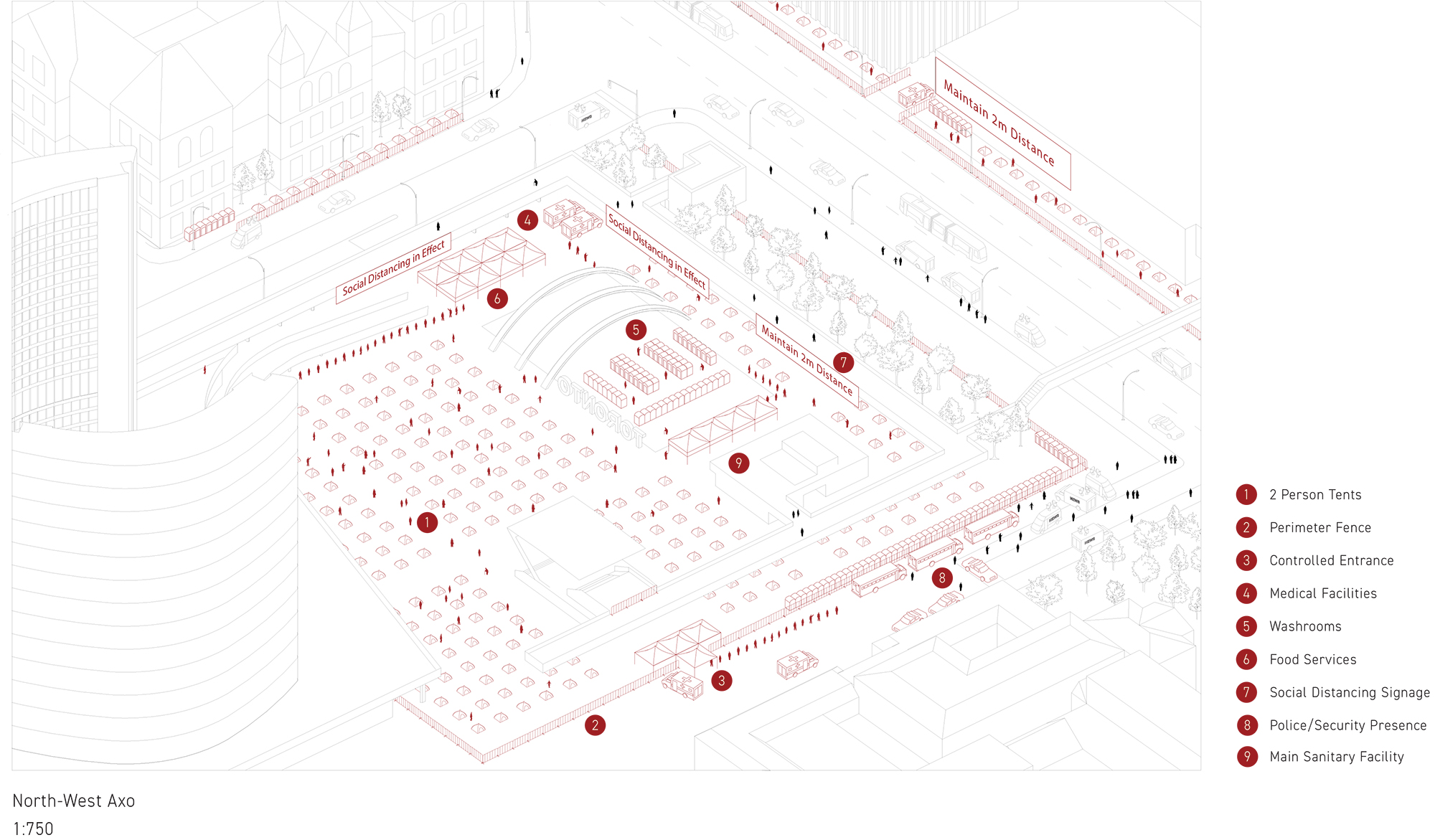
(Click here to view a larger version.)
Jay Potts
Jay conducted a study of the floor plans of Toronto-area long-term care homes, in an attempt to discover whether or not there was anything about the design of the buildings that was contributing to the astonishingly high COVID death rates being reported in eldercare facilities at the time. "When we started looking at this problem, it was reported that 82 per cent of COVID-19 deaths in Ontario were occurring in long-term care homes," Jay says. "This has mainly been attributed to Ontario's systemic disinvestment in this sector."
He obtained plans for two local long-term care homes: the Briton House, a high-rise complex in midtown, and One Kenton Place, a four-storey facility in North York. In collaboration with Master of Architecture student Lina Kostoff, he created drawings that superimpose two-metre social distancing bubbles on each set of plans. The visualization highlighted a disturbing fact. "I found that Ontario's construction standards for long-term care homes didn't account for social distancing," Jay says. Narrow hallways and crowded, multi-occupant residential rooms made isolation all but impossible.
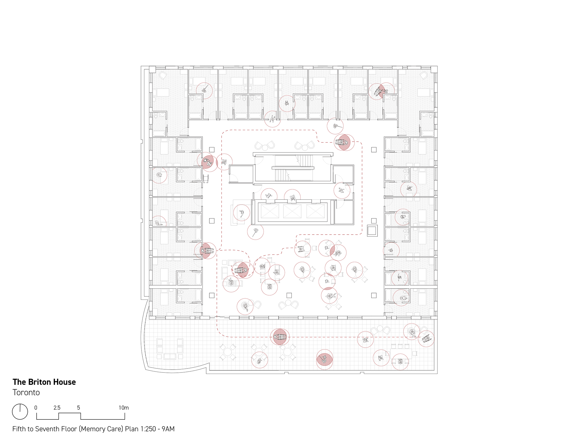
A Briton House floor plan. (Click here to view a larger version.)
As a final step, Jay applied a similar treatment to floor plans from the Arkansas State Veterans Home, in North Little Rock — a facility designed according to the "small house" model of long-term care, which aims to improve quality of life for residents by, among other things, giving them private bedrooms and minimizing walking distances to shared amenities. The Arkansas approach, Jay found, was more amenable to social distancing and quarantine.
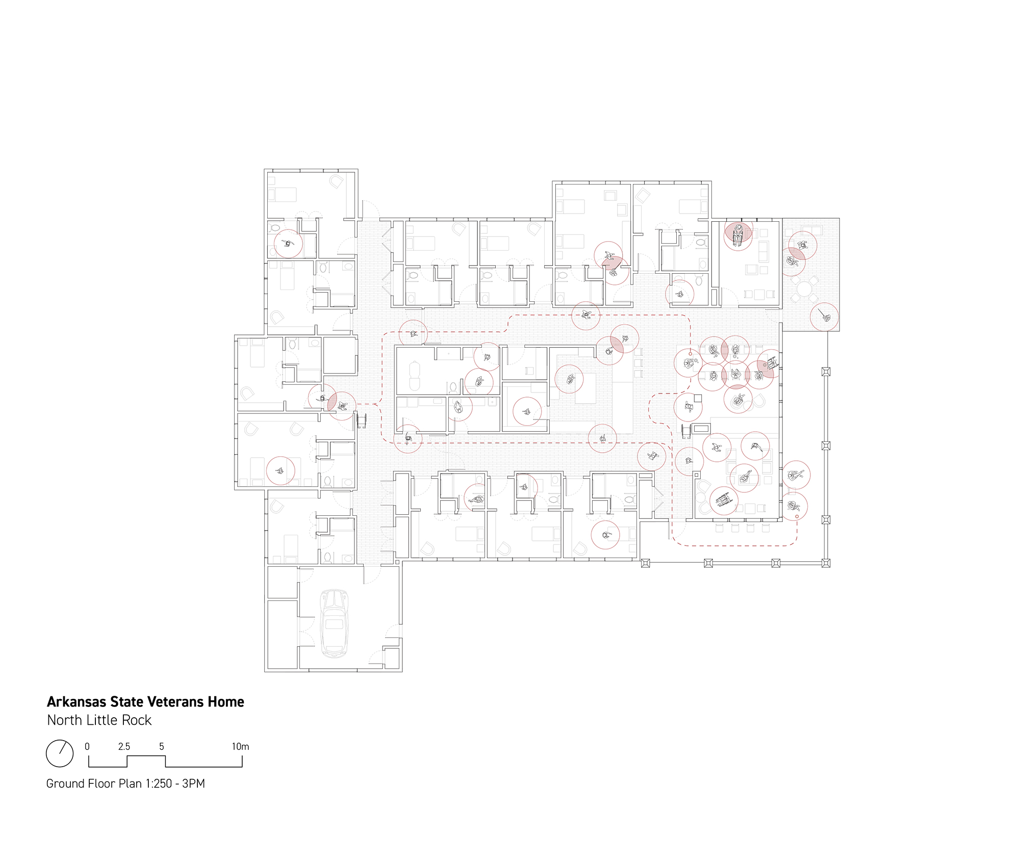
An Arkansas State Veterans Home floor plan. (Click here to view a larger version.)
Joshua Sam-Cato
Joshua began by examining data on the geographical distribution of COVID-19 cases in Toronto. He noticed that infections were not evenly spread across they city: residents of certain neighbourhoods were more likely to contract the virus. When he compared those infection-prone neighbourhoods, he realized that many of them had something in common: they had higher-than-average amounts of land zoned for industrial uses.
Here's a map he created showing the correlation between industrial areas and COVID infections. The blackened areas are industrial buildings, and the height of the vertical lines corresponds to the prevalence of the virus:
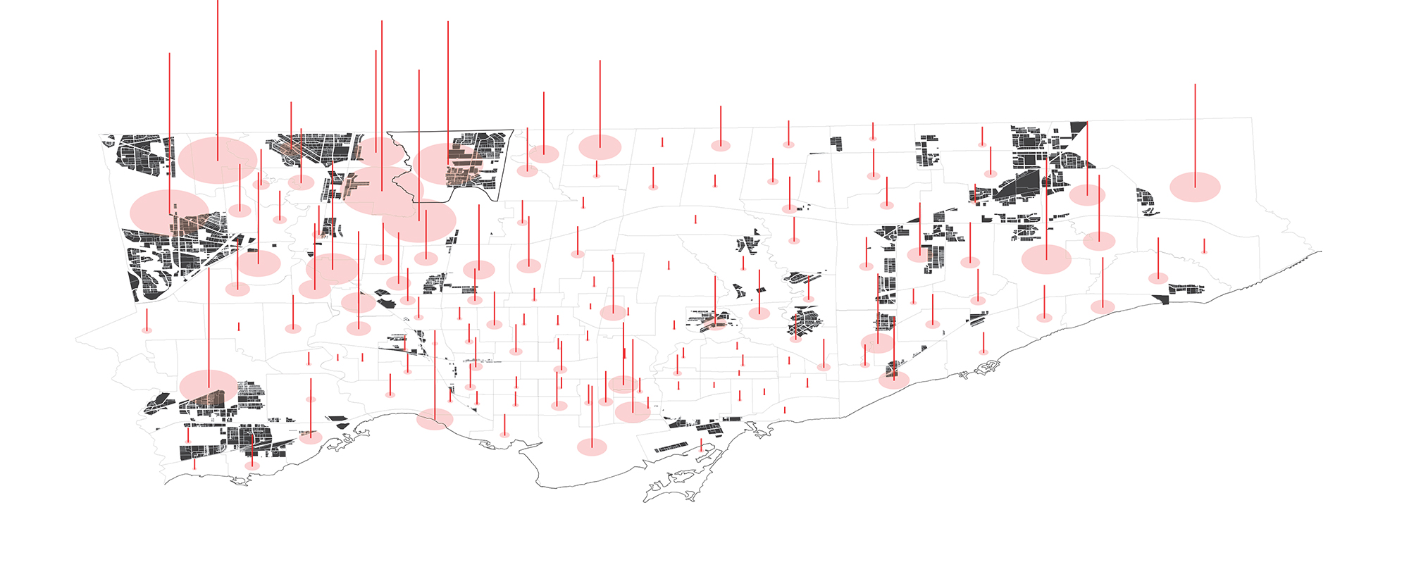
(Click here to view a larger version.)
Joshua theorized that the relationship between industrial areas and COVID might have to do with the fact that many industrial jobs aren't compatible with social distancing, because they can't be done remotely and they often require workers to be in close quarters with one another. To gain a sense of the employment mix in these areas, he took a single neighbourhood, York University Heights, and created a colour-coded map that shows the variety of different industries represented in the industrial zones:
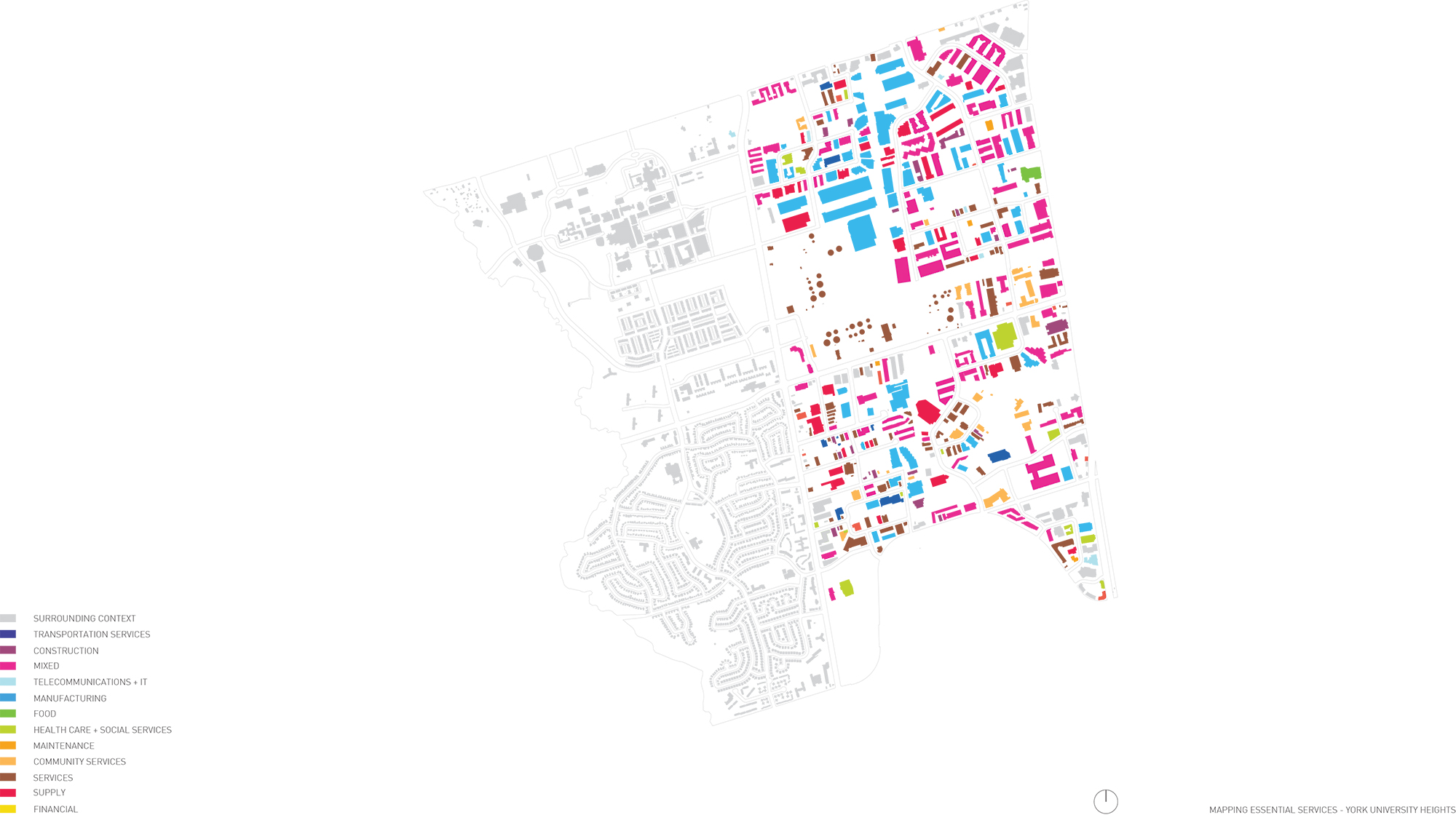
(Click here to view a larger version.)
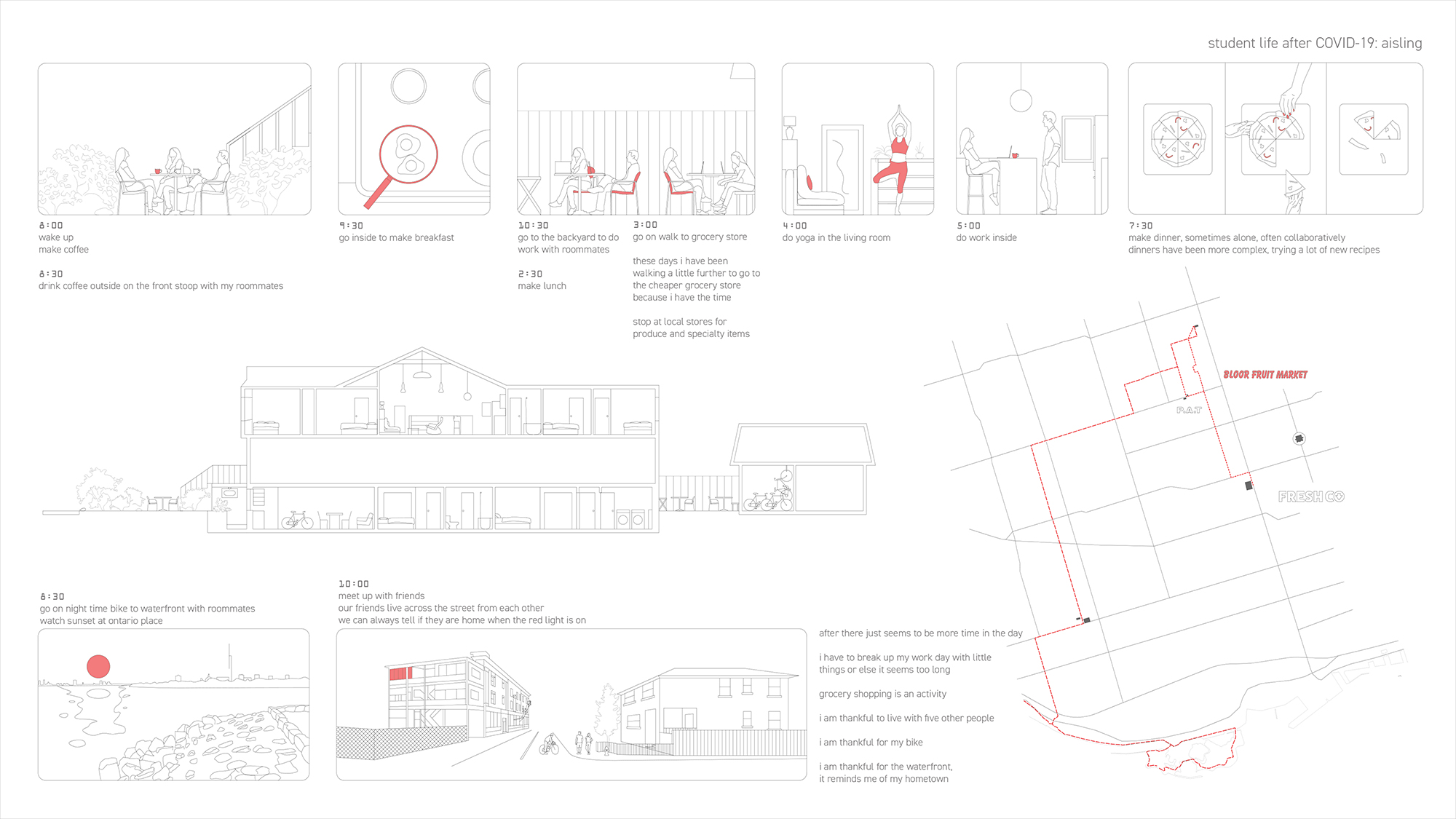
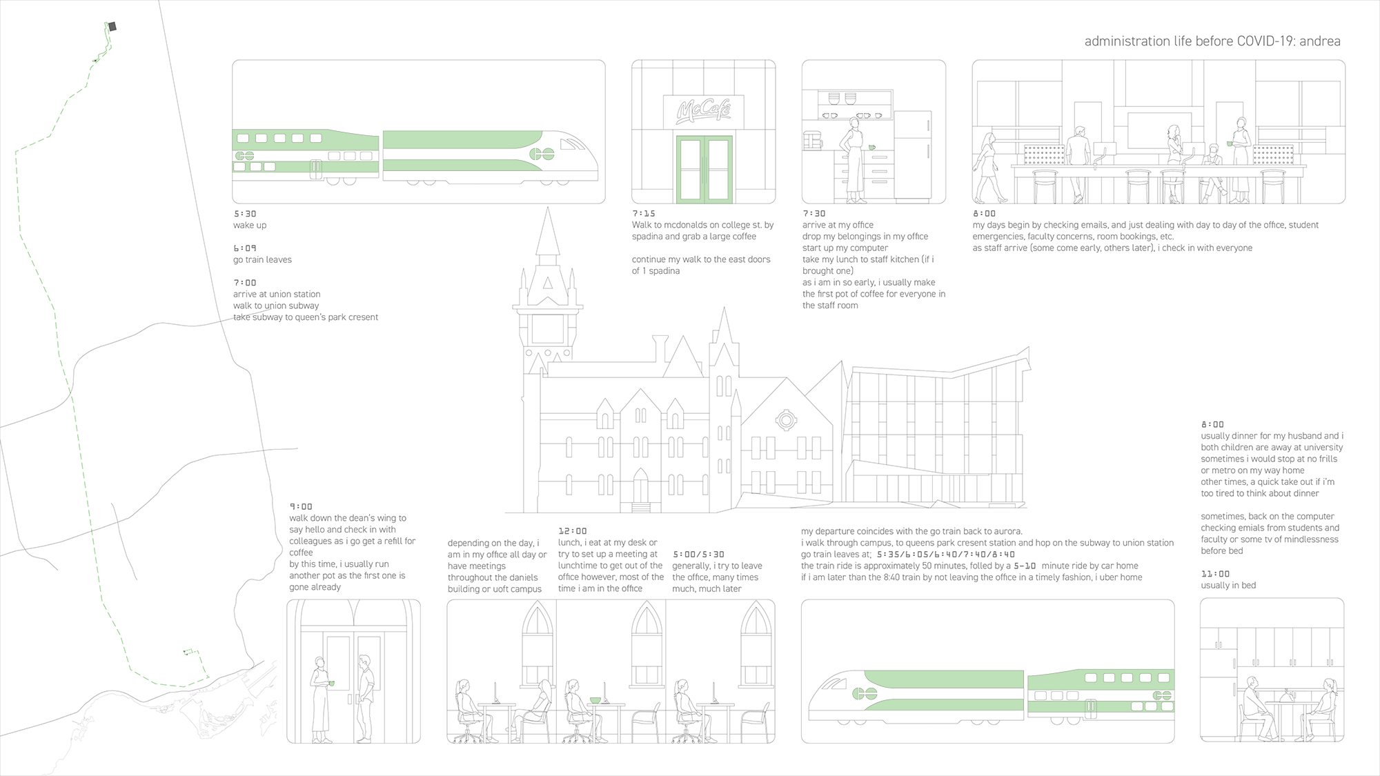
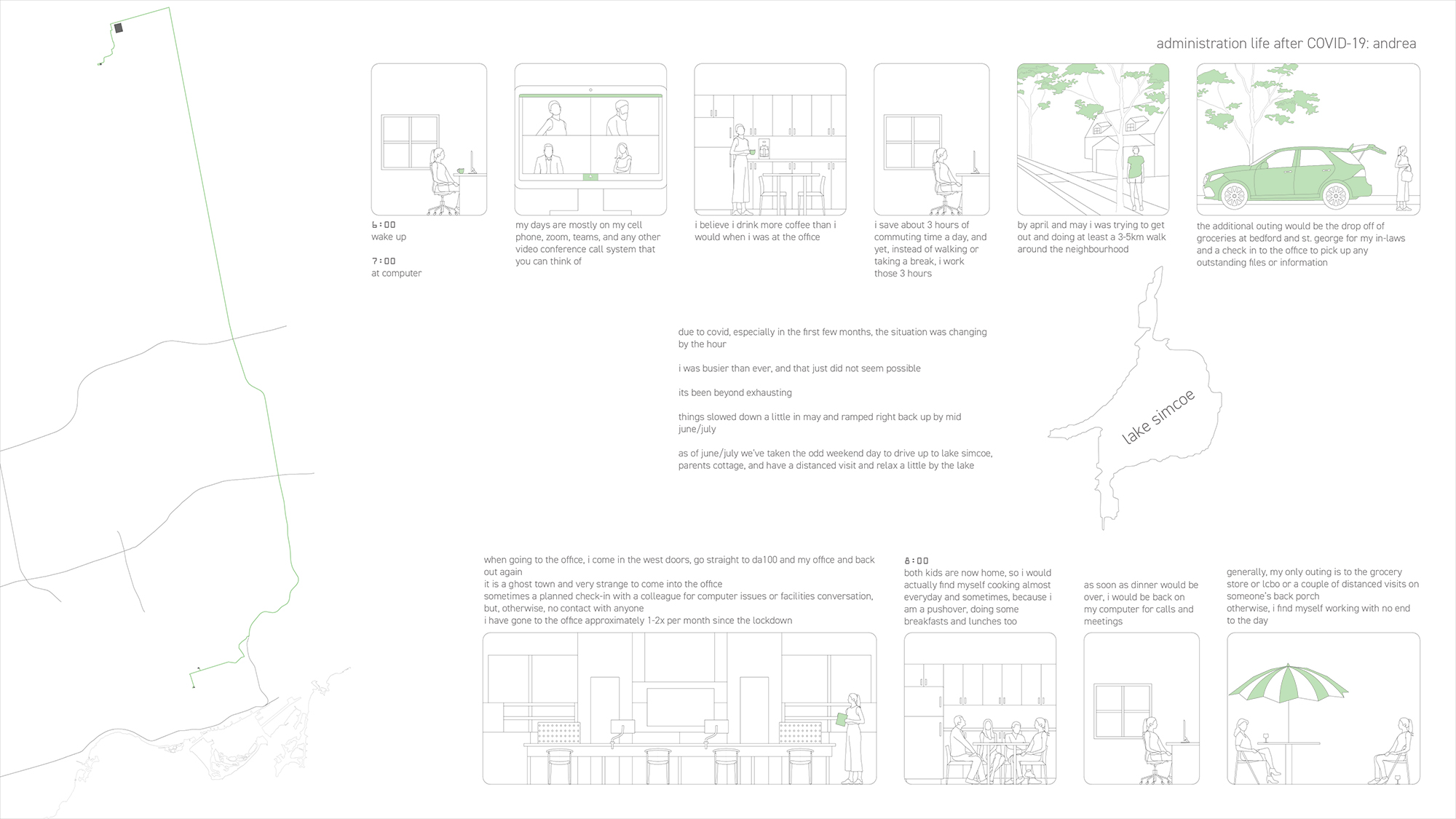
Aisling Beers
Aisling took an ethnographic approach to studying the effects of COVID-19. She produced a series of storyboards showing the daily routines of three Daniels Faculty community members — herself, a professor, and a member of the Faculty's administrative staff — before and during the pandemic.
The exercise made her notice something about the pandemic's effect on people. "All of the post-pandemic stories were very similar," Aisling says. "People are united in a shared experience of living and working from home. Which I think is interesting compared to the 'before' stories, where everyone was living very different lives."
Here's the before-and-after of Aisling's own routine:
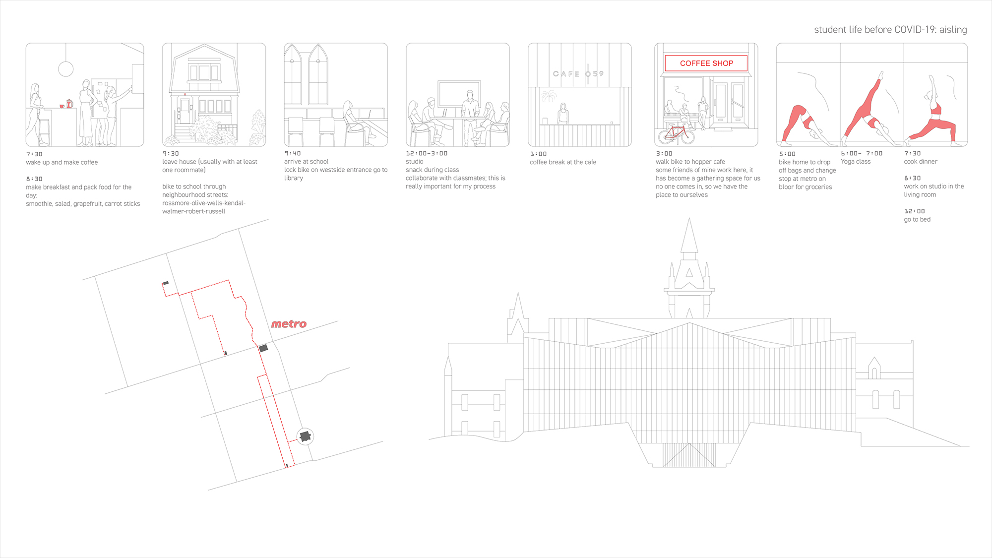
(Click here to view a larger version.)
(Click here to view a larger version.)
And here's the staff member:
(Click here to view a larger version.)
(Click here to view a larger version.)
Gemma Robinson
For her project, Gemma kept things close to home. She scrutinized the Daniels Building's floor plans for "pinch points" — places where it might be difficult for people to maintain the required two metres of distance.
She homed in on a few particularly problematic spots: a corridor next to an elevator, a waiting area outside some bathrooms, and the "commons" area inside the building's main entrance, where a student-run café tends to attract crowds.
For each of her pinch points, she created an animated vignette that shows how people would move through the space. The red spots indicate violations of social distancing protocol. Here's the elevator corridor:

And the commons:

Sheetza McGarry
Sheetza focused on creating visualizations of viral spread at human scale. She drew axonometric images of the virus travelling through air, and then created similar drawings in plan.
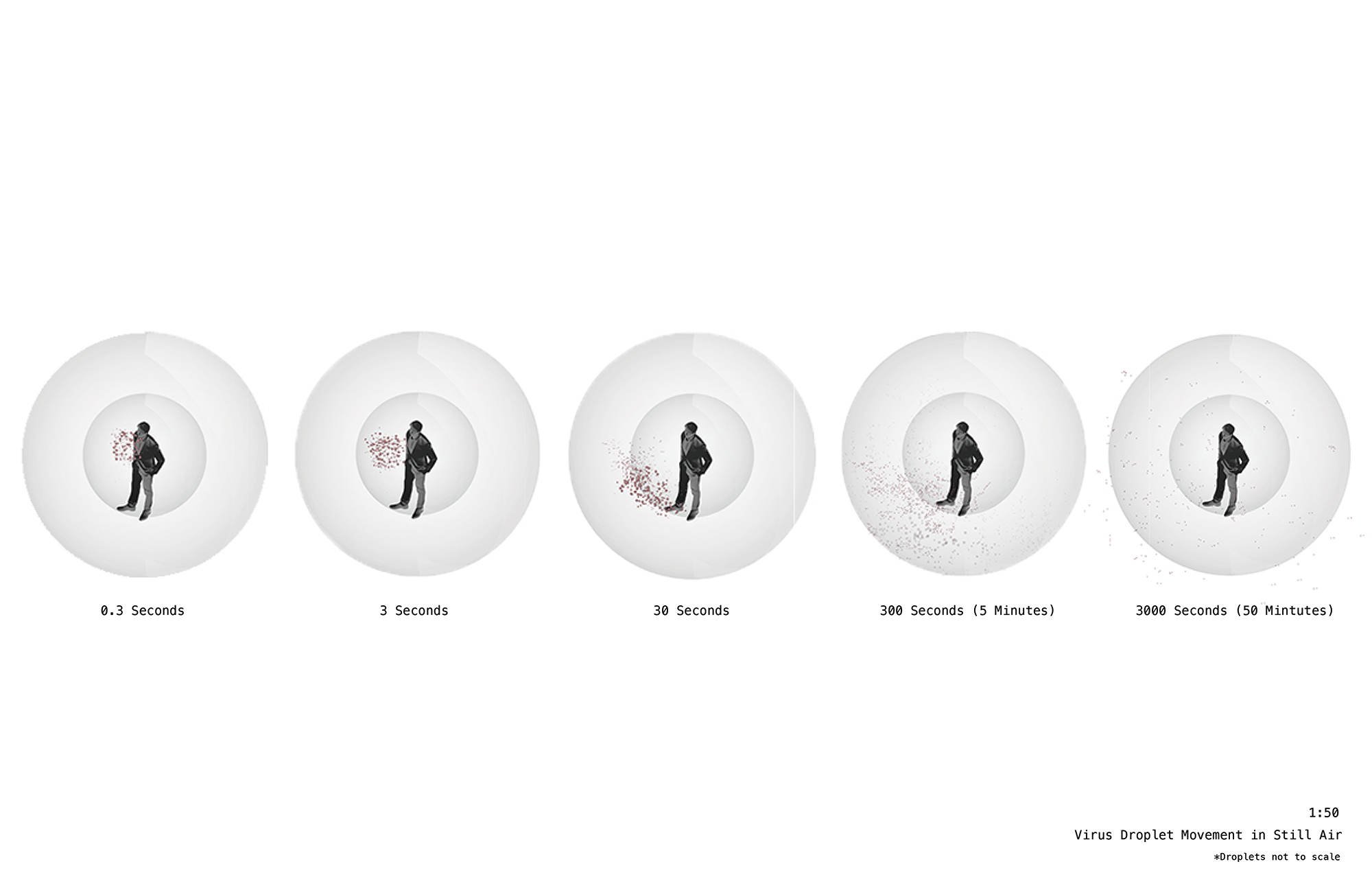
Viral spread in axonometric view. (Click here to view a larger version.)
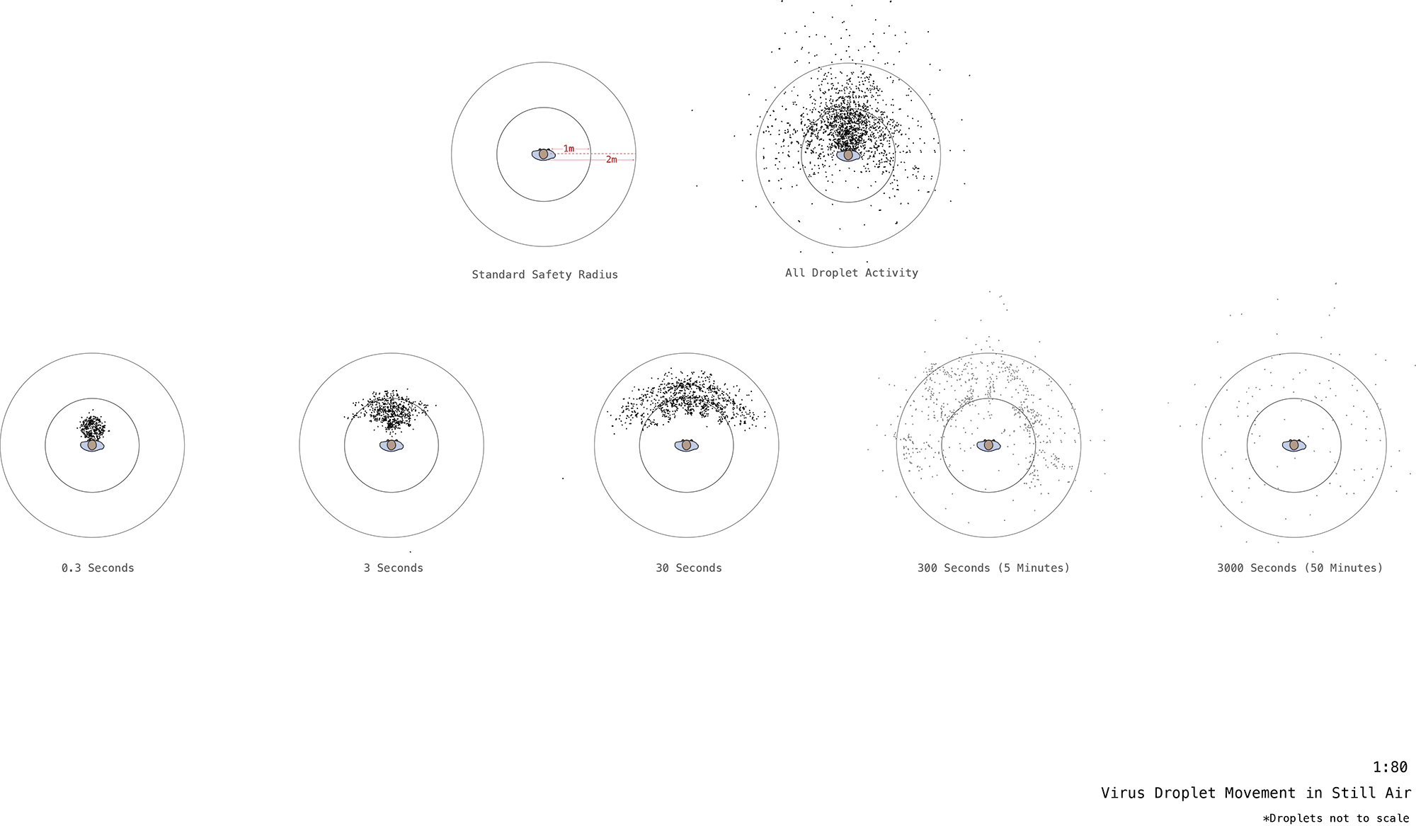
Viral spread in plan. (Click here to view a larger version.)
Drawing and thinking about the way the virus emanates from individual humans allowed Sheetza to see virus-prevention efforts from a new perspective. "Putting these things into real space made me realize just how much of stopping the virus is about personal prevention and conscientiousness," she says. "The most important thing is that everyone understands their responsibility to the community."